




What to Put on a Race Medal: A Design Checklist for 5K, 10K & Marathon Events

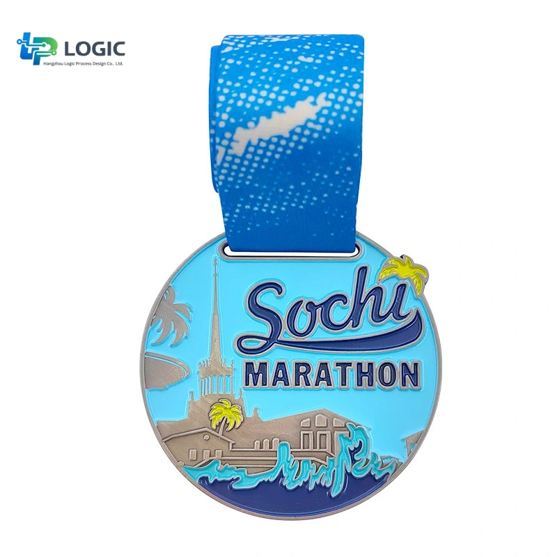
Race organizers often know the medal should include the event logo and race name, but the harder question is what else belongs on the front, back and ribbon. A good race medal needs to identify the event quickly, stay readable at the finished size and leave enough room for the design to feel intentional rather than crowded.
Quick answer: most race medals should prioritize the event name or logo, race distance, year or date, and one strong visual theme. Supporting information such as sponsor logos, slogans, location details and additional text can usually move to the back or ribbon.
Race Medal Design Checklist at a Glance
| Area | Recommended Information | Priority |
|---|---|---|
| Front | Event name or logo, race distance, year/date, main visual | Essential |
| Front | FINISHER, city or landmark, mascot, anniversary number | Optional |
| Back | Location, slogan, sponsor recognition, extra race information | Useful |
| Ribbon | Event name, logo, date, sponsor branding, repeated race identity | Recommended |
1. Start With the Event Name or Logo
The event identity should be one of the first things a runner can recognize. For an established race, the logo may already be strong enough to become the central design element. For a newer event, the full race name may need more visual priority.
Avoid shrinking the event name simply to make room for more decoration. If the medal is photographed at the finish line or displayed later, the event identity should still be readable without close inspection.
2. Make the Race Distance Easy to Find
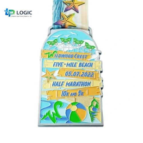
For 5K, 10K, half marathon and marathon events, the distance is often one of the most meaningful parts of the medal. It can be displayed as 5K, 10K, 13.1, 21.1K, 26.2 or 42.2K, depending on the audience and market.
When one event includes several distances, a shared design system with different distance markers can keep the medal series visually consistent while still making each achievement distinct.
3. Include the Year or Event Date
A race medal is also a dated keepsake. Including the year helps distinguish one edition from another and is especially important for annual 5K races, marathon series, charity runs and school events.
The full event date is useful when the date itself carries significance. If space is tight, the year alone is usually easier to read.
4. Use One Strong Race Story
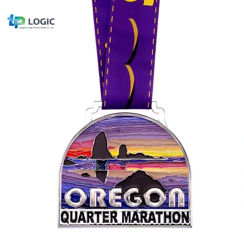
The central artwork should communicate one clear idea. Common directions include a city skyline, landmark, race route, mountain profile, local landscape, event mascot, charity symbol or anniversary number.
Trying to combine all of these at once often makes the medal look busy. A simpler concept also gives 2D and 3D relief more room to work.
5. Decide Whether “FINISHER” Belongs on the Front
For mass-participation races, the word FINISHER can reinforce the achievement and works well when the medal is intended for everyone who completes the course. It is not mandatory, however.
If the event name, distance and main artwork already fill the front, moving supporting wording to the back can produce a cleaner result.
6. Put Secondary Information on the Back
The reverse side is useful for information that matters but does not need to dominate the first impression. Depending on the event, this can include:
- Race location or city
- Short event slogan
- Anniversary message
- Sponsor recognition
- Course or elevation reference
- Blank area for engraving or numbering
This approach lets the front stay visually strong while still giving organizers enough room for event details.
7. Use the Ribbon as Part of the Branding
The ribbon is not just an attachment. It gives you additional space for repeated event branding, sponsor logos, dates, slogans and colors without crowding the medal itself.
For more detail on width, printing and attachment options, see our Custom Medal Ribbon Guide.
8. Keep Sponsor Logos Under Control
Sponsor recognition is important, but placing too many sponsor marks on the front can weaken the medal design. A practical hierarchy is:
- Primary event identity on the front
- Major sponsor only if contractually required
- Secondary sponsors on the back or ribbon
This protects readability while still giving sponsors visible placement.
9. Match the Information to the Medal Size
A 2-inch medal cannot carry the same amount of text and detail as a 3.5-inch medal. Before adding more wording, make sure the chosen size gives the artwork enough physical space.
See our Custom Medal Size and Thickness Guide if the overall dimensions have not been confirmed yet.
10. Design the Medal and Ribbon Together
One of the easiest ways to create a more complete race identity is to review the medal and ribbon as one system. The ribbon can repeat a logo, date or sponsor message while the medal focuses on the achievement and event story.
What Changes for 5K, 10K and Marathon Medals?
The basic checklist stays the same, but the emphasis can change by event type.
| Event Type | Common Design Priority | Useful Elements |
|---|---|---|
| 5K / Fun Run | Clear identity and energetic visual | 5K, charity theme, mascot, bright enamel |
| 10K | Distance + event branding | 10K, route, landmark, year |
| Half Marathon | Achievement and collectible value | 13.1 / 21.1K, city identity, relief |
| Marathon | Premium finish and strong event story | 26.2 / 42.2K, landmark, FINISHER, 3D detail |
Common Race Medal Design Mistakes
- Too much small text on the front
- Distance is difficult to find
- Using several competing visual themes
- Adding sponsor logos without a clear hierarchy
- Choosing a medal size before checking the artwork
- Treating the ribbon as an unrelated afterthought
- Approving a digital design without checking how fine details will reproduce in metal
Plan Early Enough for Artwork, Production and Delivery
Race dates are fixed, so medal planning should leave time for artwork approval, mold preparation, production, quality inspection and delivery. Complex 3D structures, special finishes or multiple medal versions usually need more coordination than a simple 2D design.
For the full workflow, see How Long Do Custom Medals Take to Produce?
Before Requesting a Quote
For faster artwork and a more accurate quotation, prepare:
- Event name and logo
- Race distance or multiple distances
- Event date and delivery deadline
- Quantity
- Preferred medal size and thickness
- Reference images or design direction
- Required sponsor logos
- Ribbon text and branding
- Delivery country and destination
If you are still comparing budget options, our Custom Medal Cost Guide explains the main factors that affect pricing.
FAQ
What should always be on a race medal?
The safest core information is the event name or logo, race distance, year or date, and one clear visual theme. Other details depend on the event.
Should a 5K medal say “FINISHER”?
It can, especially for participant medals, but it is not required. If the medal already has a strong event identity and limited space, the design may look cleaner without it.
Where should sponsor logos go on a race medal?
Major sponsors can appear on the front when necessary, but secondary sponsor logos are often easier to organize on the back or printed ribbon.
Should the ribbon match the medal design?
Yes. Coordinating the medal and ribbon helps the complete award look intentional and gives organizers additional space for branding and sponsor information.
Can one design be used for several race distances?
Yes. A shared design family with different distance text, enamel colors or plating can create a consistent series for 5K, 10K, half marathon and marathon events.
Planning Custom Race Medals?
Send us your event logo, race distance, quantity, deadline and design references. We can help convert the idea into a production-ready zinc alloy medal with custom relief, plating, enamel and ribbon options. MOQ starts from 50 pieces.